karlfred design

made to wear
designed to hold

Apparel and packaging bring a brand into everyday life, from what people wear to what they take home.

The collection
Selected work & upcoming projects
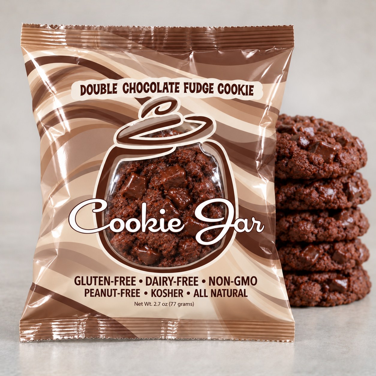
Double chocolate fudge cookie packaging with cocoa swirls, with a clear jar window and matching cookie stack
1 / 3
Design study / 01

a taste of something good

The Cookie Jar / Retail Cookie Packaging

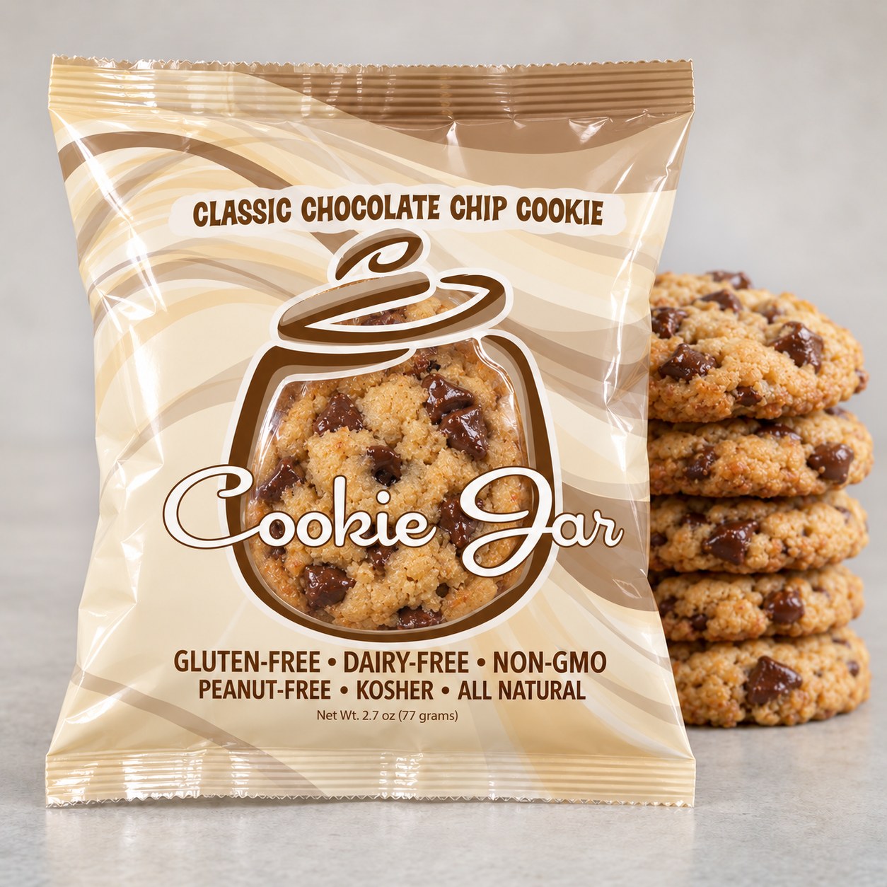
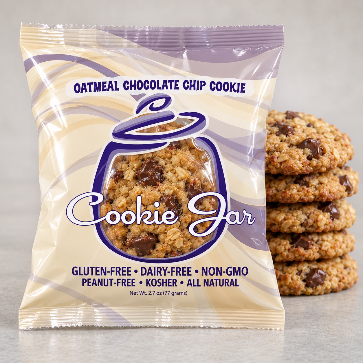
The Cookie Jar began as Stephanie Nelson’s passion project: cookies that brought together natural ingredients, accessible pricing, and delicious flavor. The packaging needed to communicate that care while letting the product speak for itself.

Designed for a two-cookie pack—because one is never enough—the wrapper turns the swirled jar logo into a clear window. Customers can see the cookies inside, showcasing the product Stephanie was proud to share. Flowing waves suggest stirred batter and the comfort of a freshly baked treat, while flavor-specific colors give each variety its own character within a cohesive family.

Cream and cocoa tones distinguish classic chocolate chip, richer browns introduce double chocolate fudge, and lavender and cream set apart the oatmeal variety. Clear product information completes a package designed to feel inviting on the shelf.

Focus
Product visibility & flavor recognition
Deliverables
Two-cookie retail wrappers & coordinated flavor range
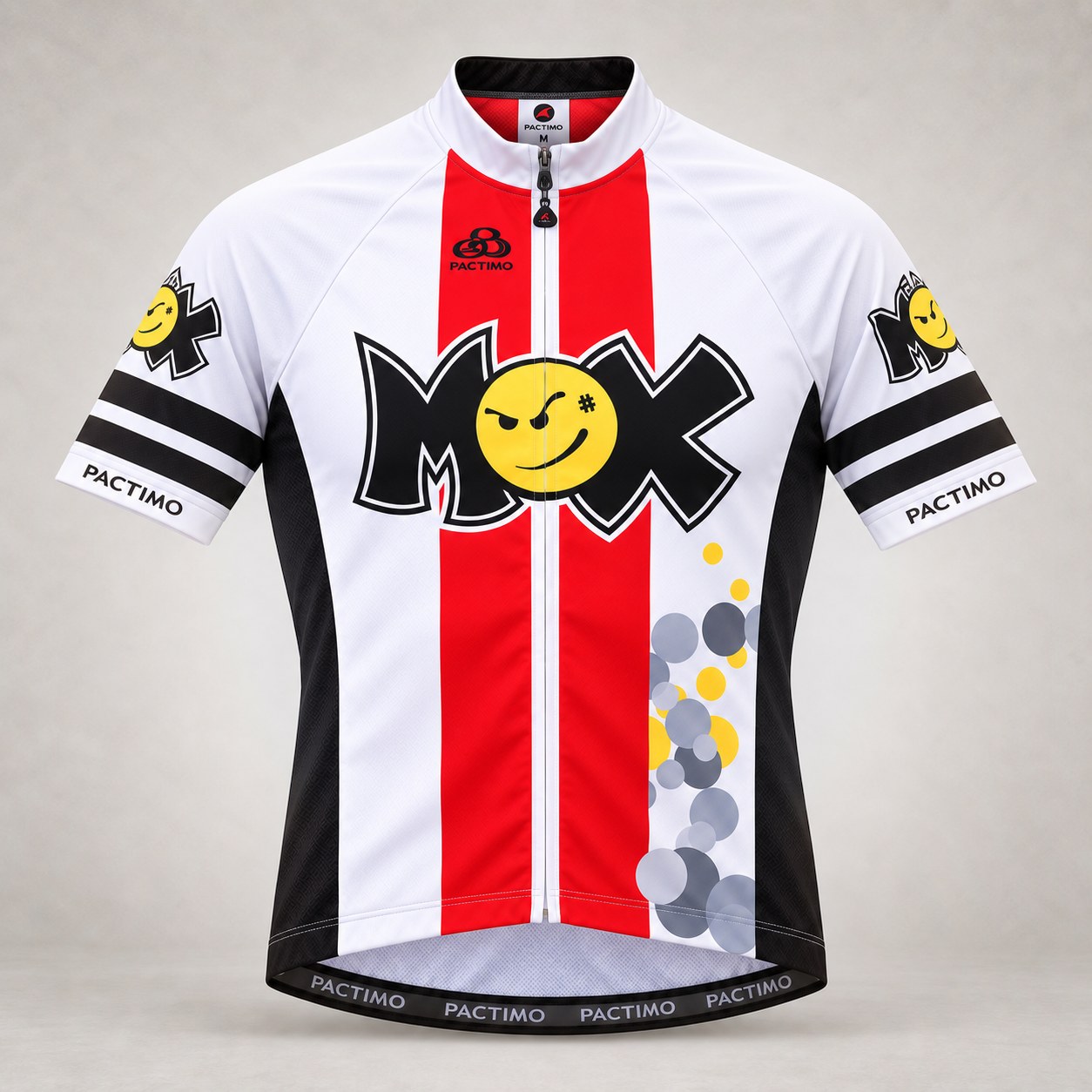
MOX cycling jersey with two red front stripes
1 / 7
Design study / 02

a brand in motion

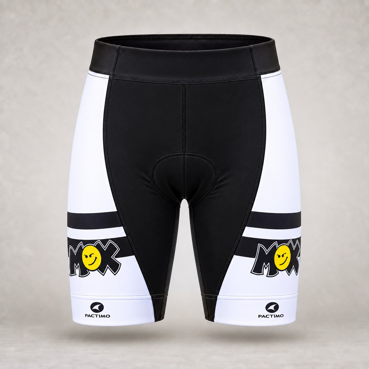
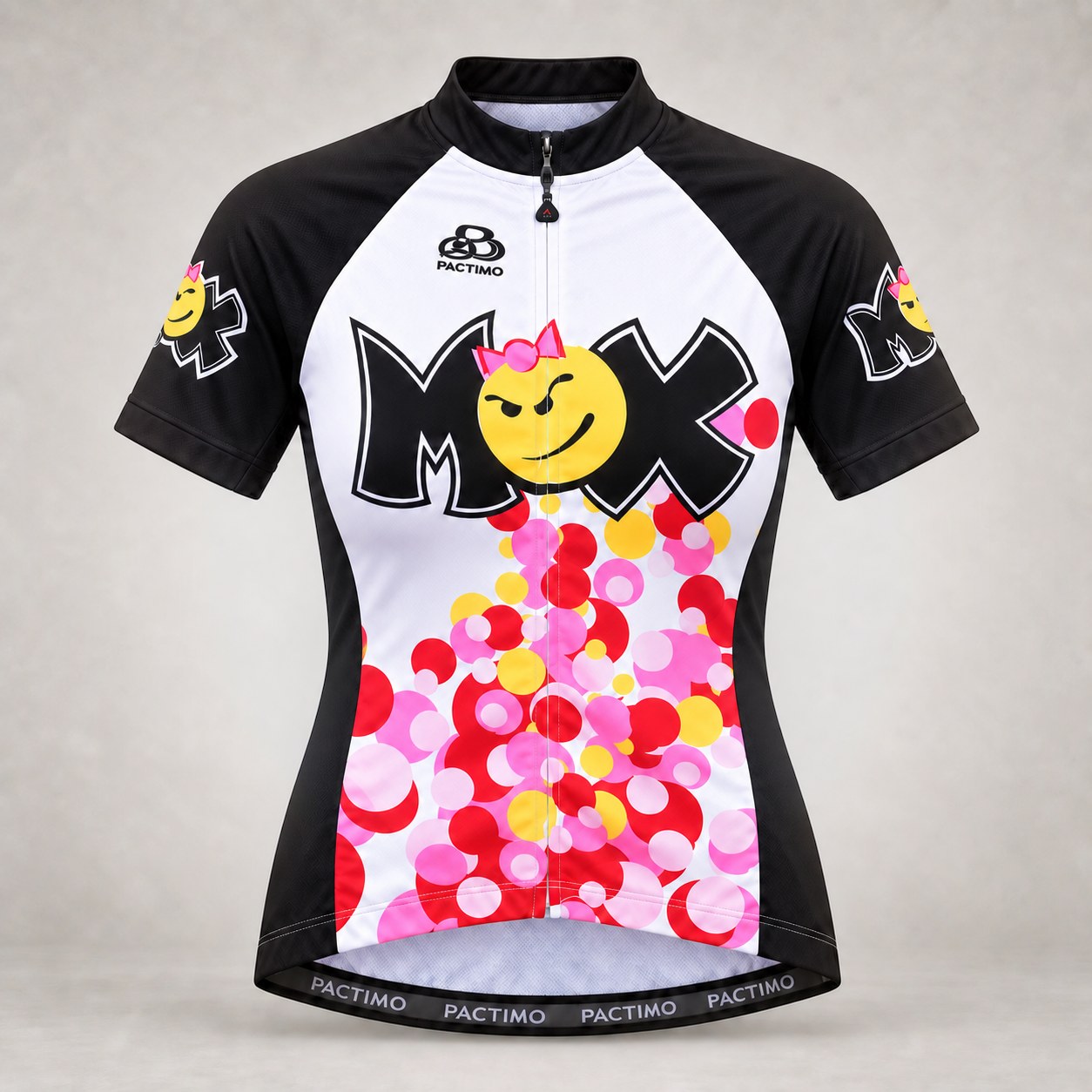
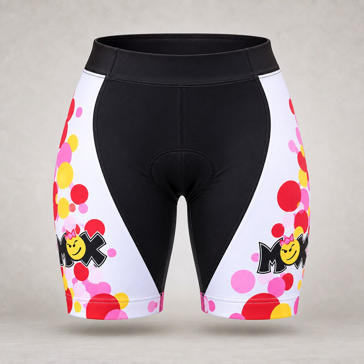
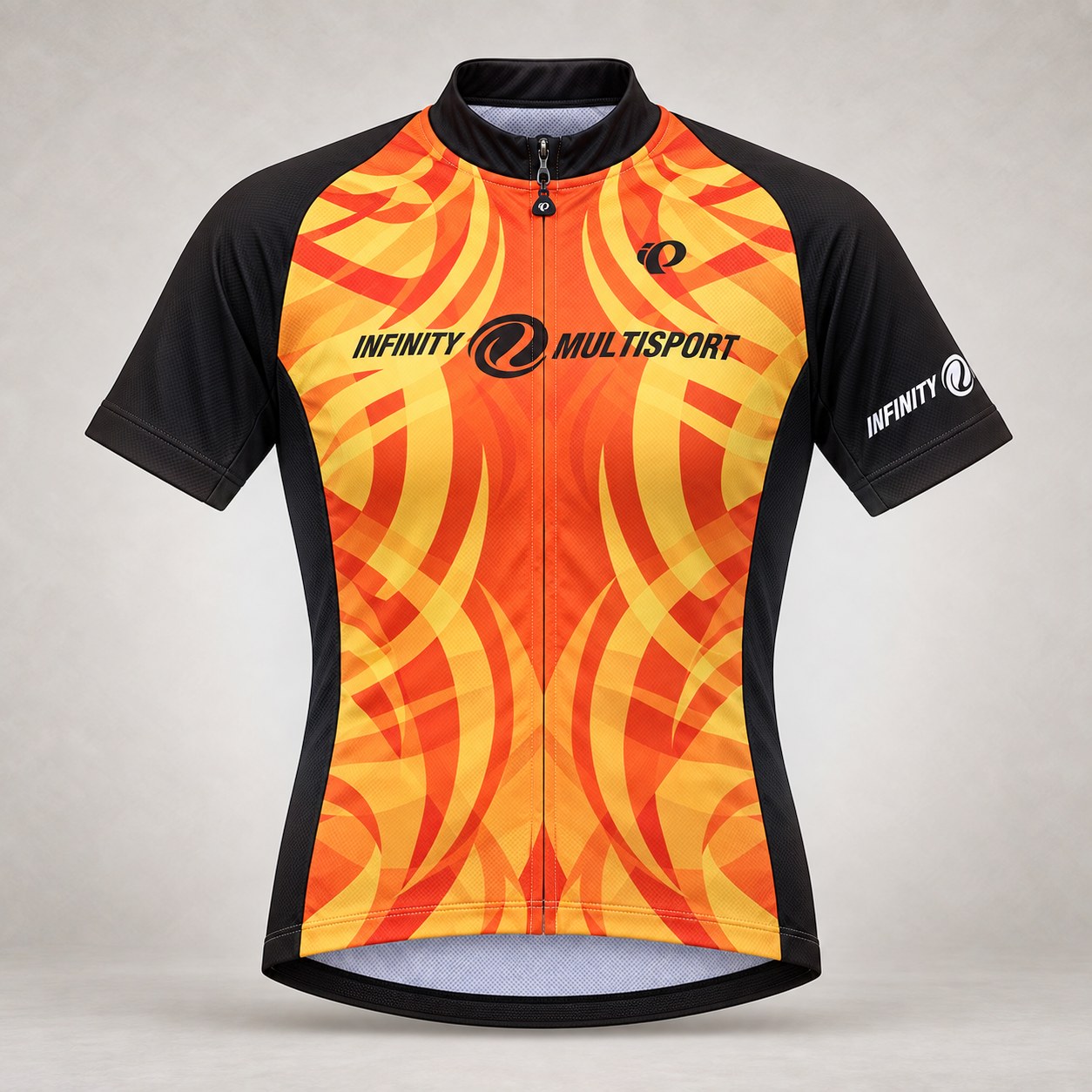
MOX Multisport & Infinity Multisport / Kit Design

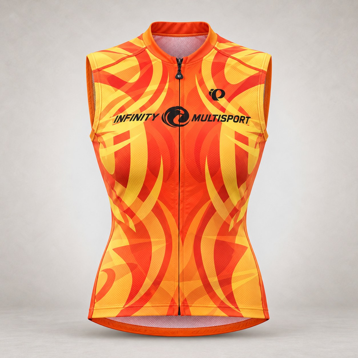
Two businesses shared a home on Chicago’s Randolph Street: MOX, a triathlon and multisport retailer upstairs, and Infinity, a training company downstairs. Indoor cycling sessions, neighborhood runs, and Lake Michigan swims brought athletes together, while their racing teams competed both together and independently across the country.

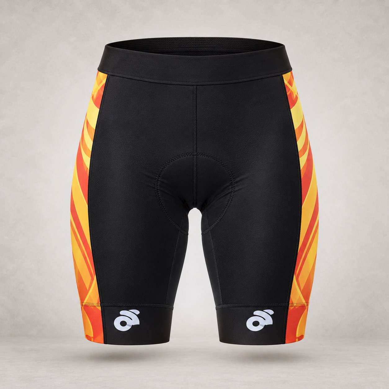
After developing the MOX name to replace Mission Bay Cycles and creating identities for both businesses, we carried their personalities into racing kits—the jerseys and shorts that make a team recognizable. MOX’s playful pink graphics welcomed athletes across ages and abilities. Infinity’s fiery oranges, reds, golds, and yellows created a more intense look, with overlapping elements of its logo forming stylized flames.

Each kit gave its team a distinct presence at races and a shared identity beyond the finish line. Fun, energetic, and easy to recognize, the designs helped both communities show up as a team.

Focus
Team identity & race-day visibility
Deliverables
Cycling jerseys, sleeveless tops & shorts
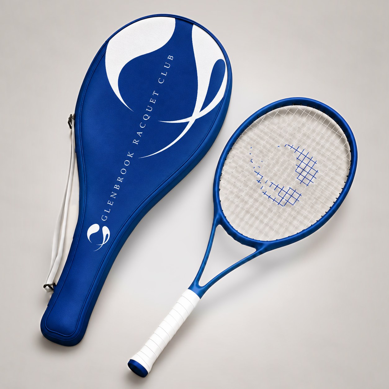
Blue Glenbrook Racquet Club tennis racquet beside its matching cover, printed with the white G mark and club name
1 / 6
Design study / 03

a return to form

Glenbrook Racquet Club / Branded Equipment & Apparel

When new ownership took over Glenbrook Racquet Club on Chicago’s North Shore, the facility felt drab and dated: dark woods, worn green courts, and little to signal the experience members expected. A complete renovation brought high-quality turf courts in a Wimbledon-inspired blue, and that blue, paired with crisp white, became the foundation of the club’s new brand.

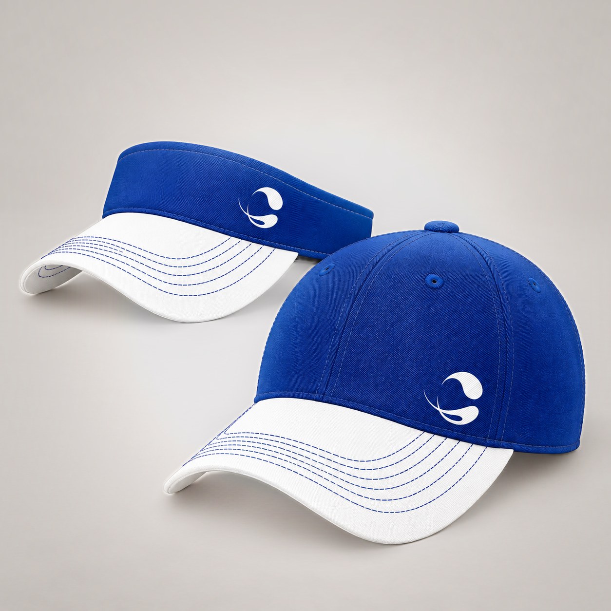
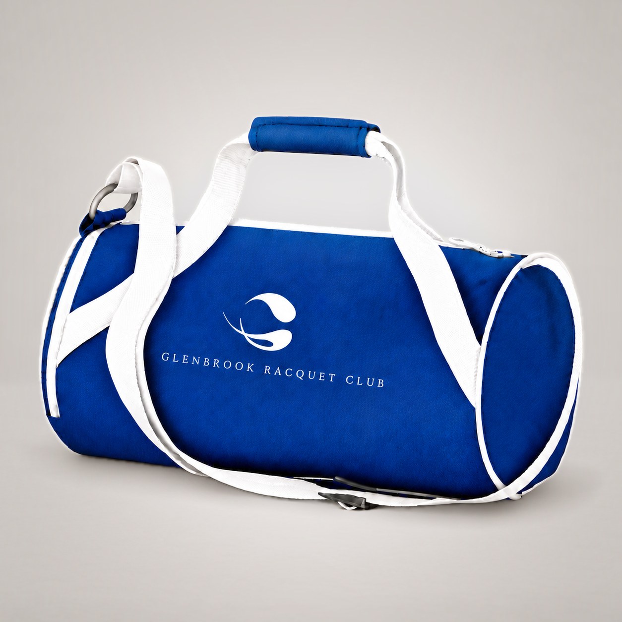
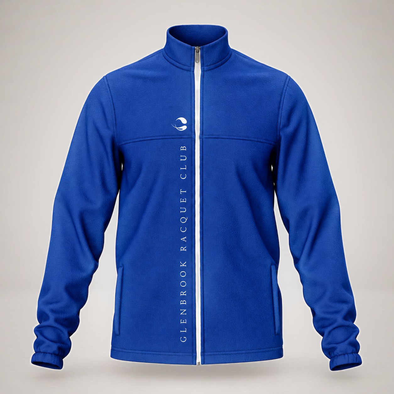
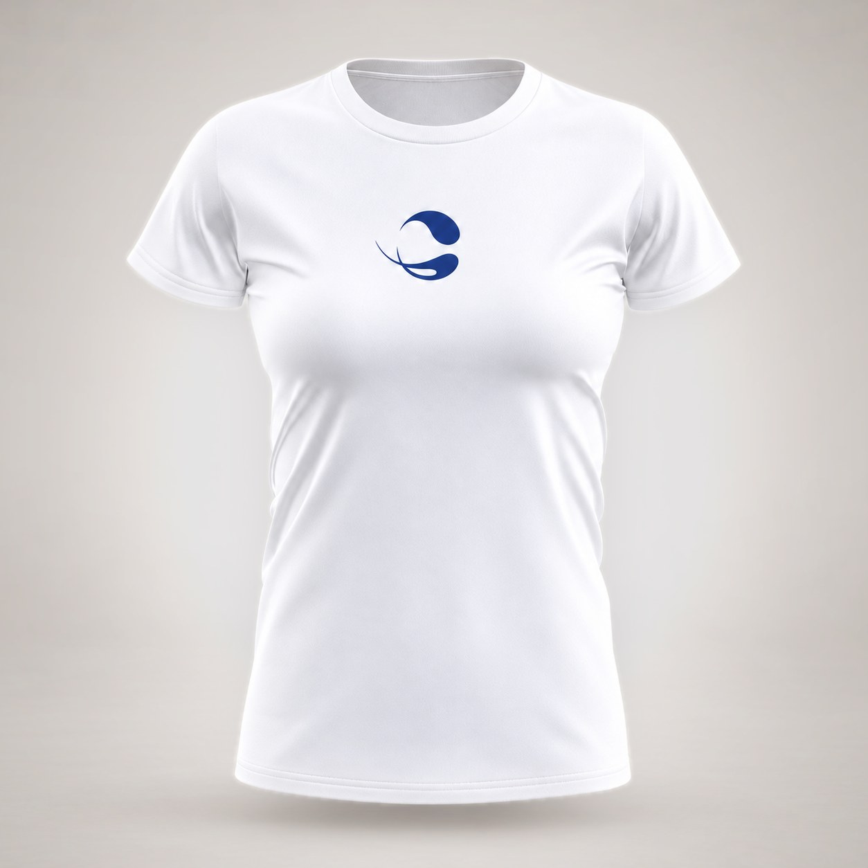
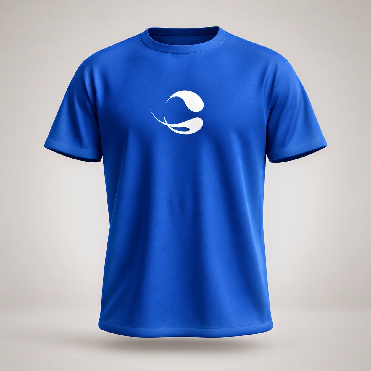
We designed the logo: a tennis ball that forms a G, with streaks of motion and speed that keep it elegant rather than loud. The mark then carried onto racquets and covers, caps and visors, bags, jackets, and tees, giving members and staff a polished, recognizable look on and off the court.

The same identity extended to signage, flyers, marketing materials, business cards, and the club’s website, all delivering one message: this was once again a premier club worth the membership. Years later, the work still stands the test of time.

Focus
Premium positioning & a cohesive club identity
Deliverables
Logo, branded equipment & apparel, signage, print & website
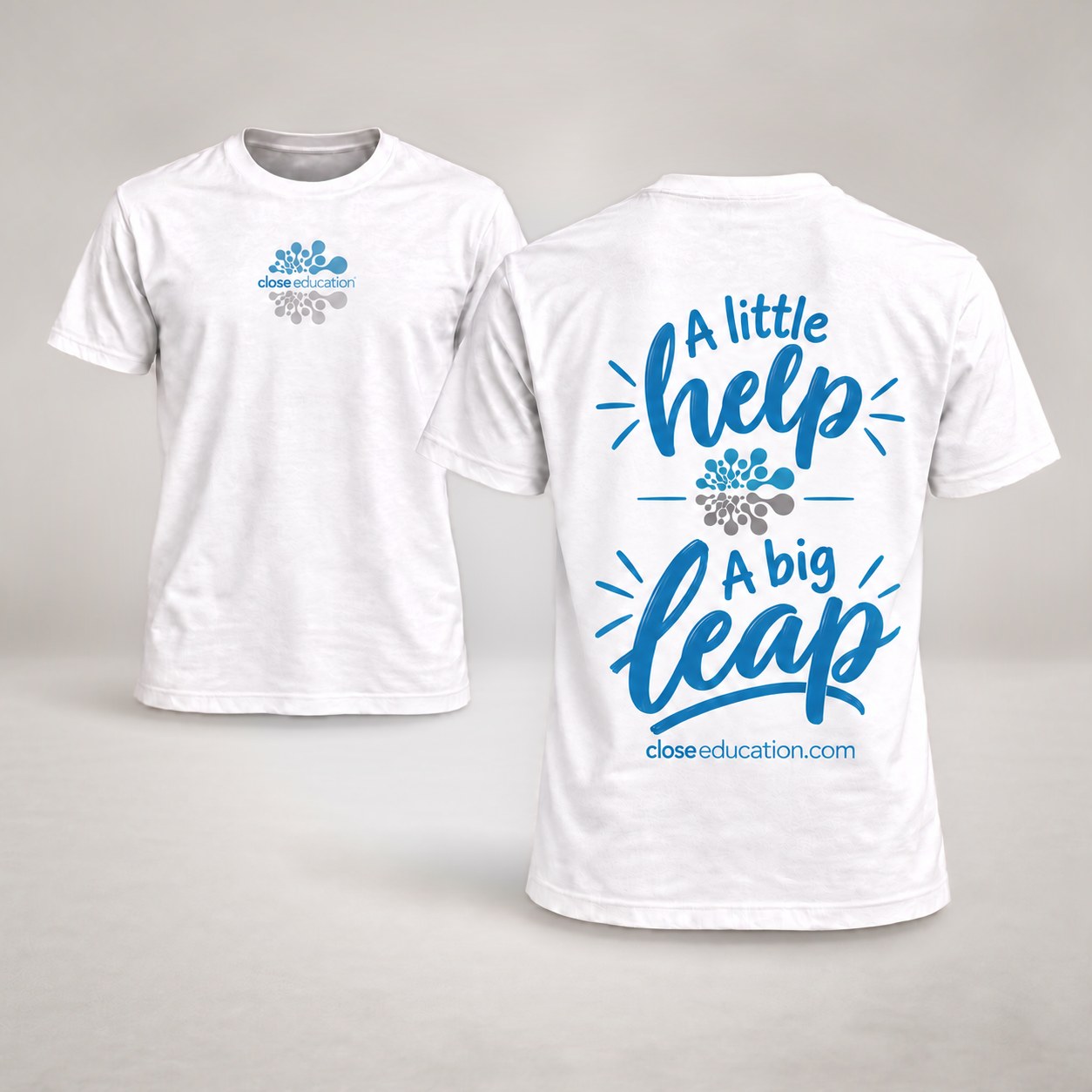
Close Education t-shirts: a small logo on the front and a little help, a big leap with the logo mark and closeeducation.com on the back
1 / 2
Design study / 04

a big leap

Close Education / Apparel & Merchandise

Close Education helps Indiana schools find the right educational technology for their teachers and students. Its apparel and merchandise carry that mission off the page with a warm, encouraging voice.

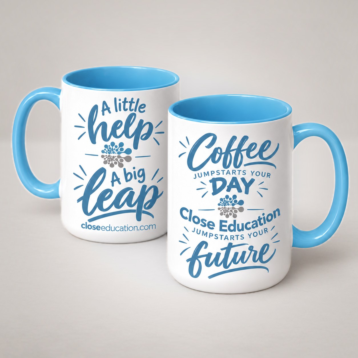
Hand-lettered phrases in Close Education blue do the talking. “A little help, a big leap” sums up what the right support can do for a learner, and a companion mug adds a smile: “Coffee jumpstarts your day. Close Education jumpstarts your future.” The brain-and-pathways mark ties each piece back to the brand.

The t-shirts keep a small logo on the front and save the message for the back, with closeeducation.com underneath. Blue handles and interiors on the mugs pick up the same color, so every piece feels like part of one family.

Focus
An encouraging voice & brand continuity
Deliverables
T-shirts & mugs

Every project starts with a clear idea.

explore all services