karlfred design

ideas made tangible
design you can hold

From the first impression to the finest detail, print gives your message a physical presence.

The collection
Selected work & upcoming projects
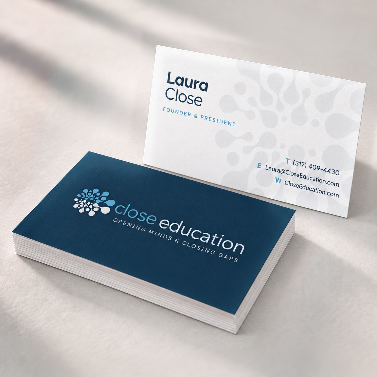
Studio mockup of Close Education business cards: a stack showing the navy logo front, with Laura Close’s white contact-information back standing behind it
Print study / 01

a personal introduction

Close Education / Business Card Design

For Laura Close, a business card was a personal introduction to a company helping Indiana schools connect students with the right educational technology. We carried Close Education’s brain-and-pathways identity into a two-sided design that made its purpose clear: opening minds + closing gaps.

The white front gives the logo and message room to breathe, while the blue reverse organizes Laura’s contact information and the company’s focus. Enlarged organic shapes connect both sides, creating a practical, recognizable piece within the broader brand system.

Focus
Brand continuity & clear communication
Deliverables
Two-sided business card design
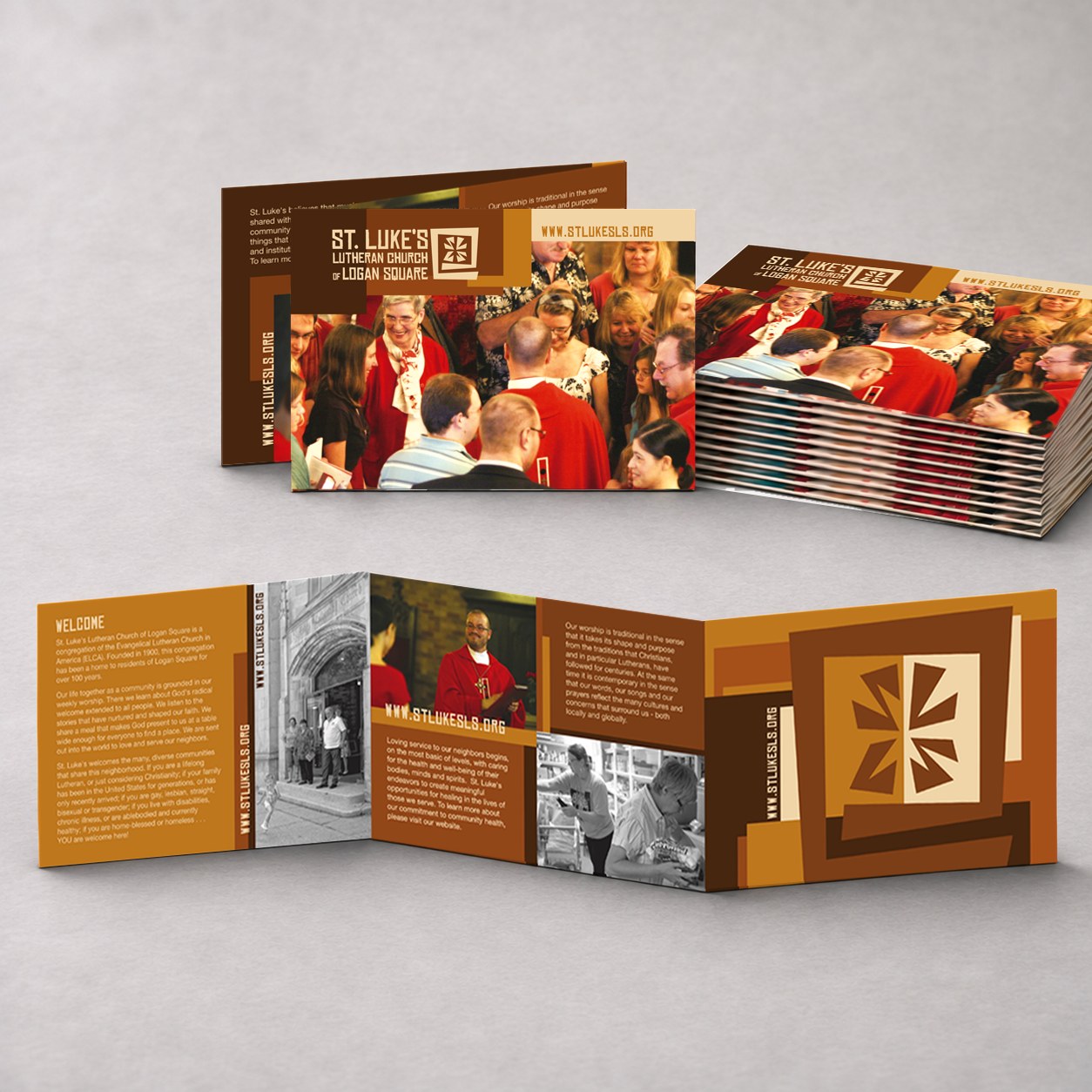
St. Luke’s welcome brochure showing its cover, a stack of folded copies, and the open interior in warm brown and gold
Print study / 02

a story worth opening

St. Luke’s / Welcome Brochure

St. Luke’s Lutheran Church of Logan Square wanted a fresh, approachable identity that reflected the energy of its Chicago community. Working with Reverend Eric Christensen, we developed an earthy, modern visual language inspired by woodblock prints and cut paper, with warm browns, golds, and pale creams.

This welcome brochure brought that identity into people’s hands. Substantial cardstock gave the trifold a reassuring feel, while photographs of parishioners, their pastor, and the historic church offered a personal introduction to the congregation and its neighborhood.

Part of a broader rebrand spanning business cards, banners, website graphics, and marketing materials, the brochure helped communicate a renewed sense of welcome. During the campaign, the church reported that its community more than doubled in six months, with hundreds more neighbors joining over the following years.

Focus
Community connection & a welcoming identity
Deliverables
Trifold welcome brochure
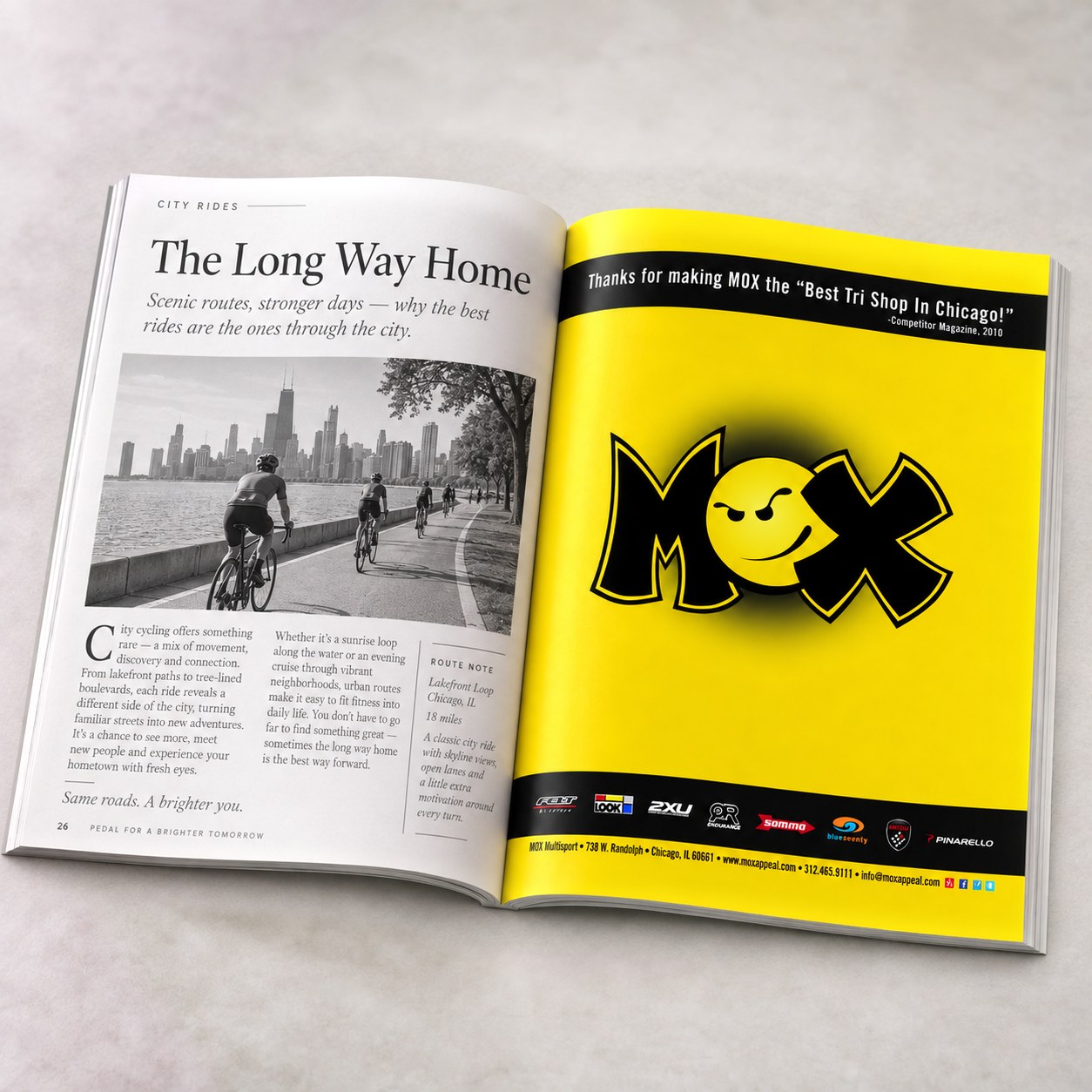
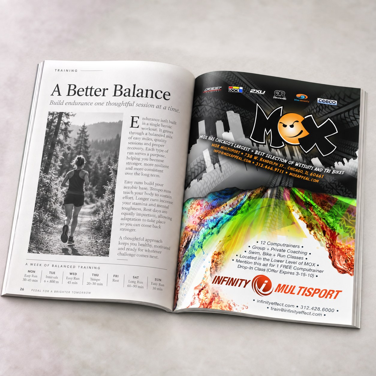
Yellow MOX brand advertisement on the right-hand magazine page
1 / 4
Print study / 03

a message that stands out

MOX Multisport / Magazine Advertising

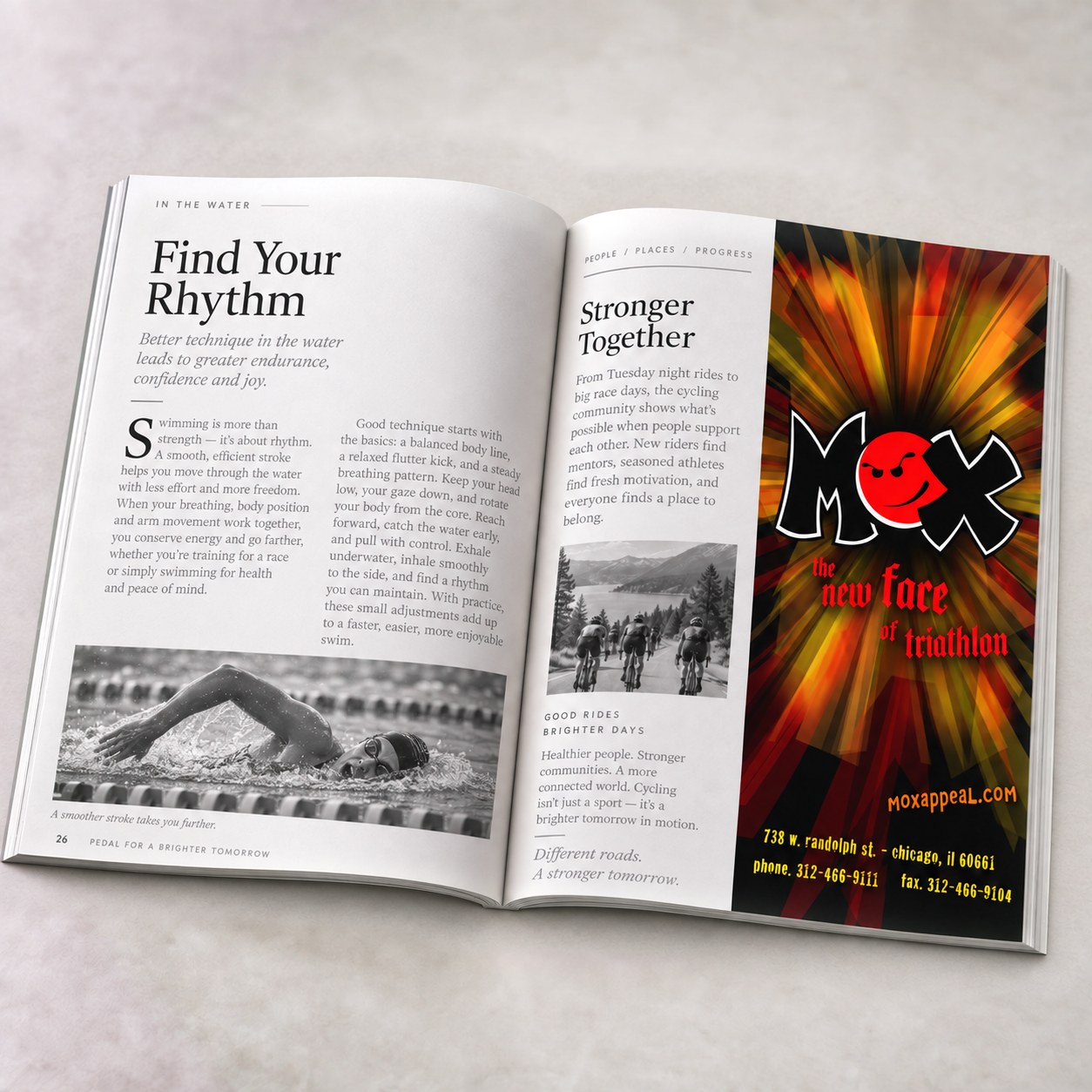
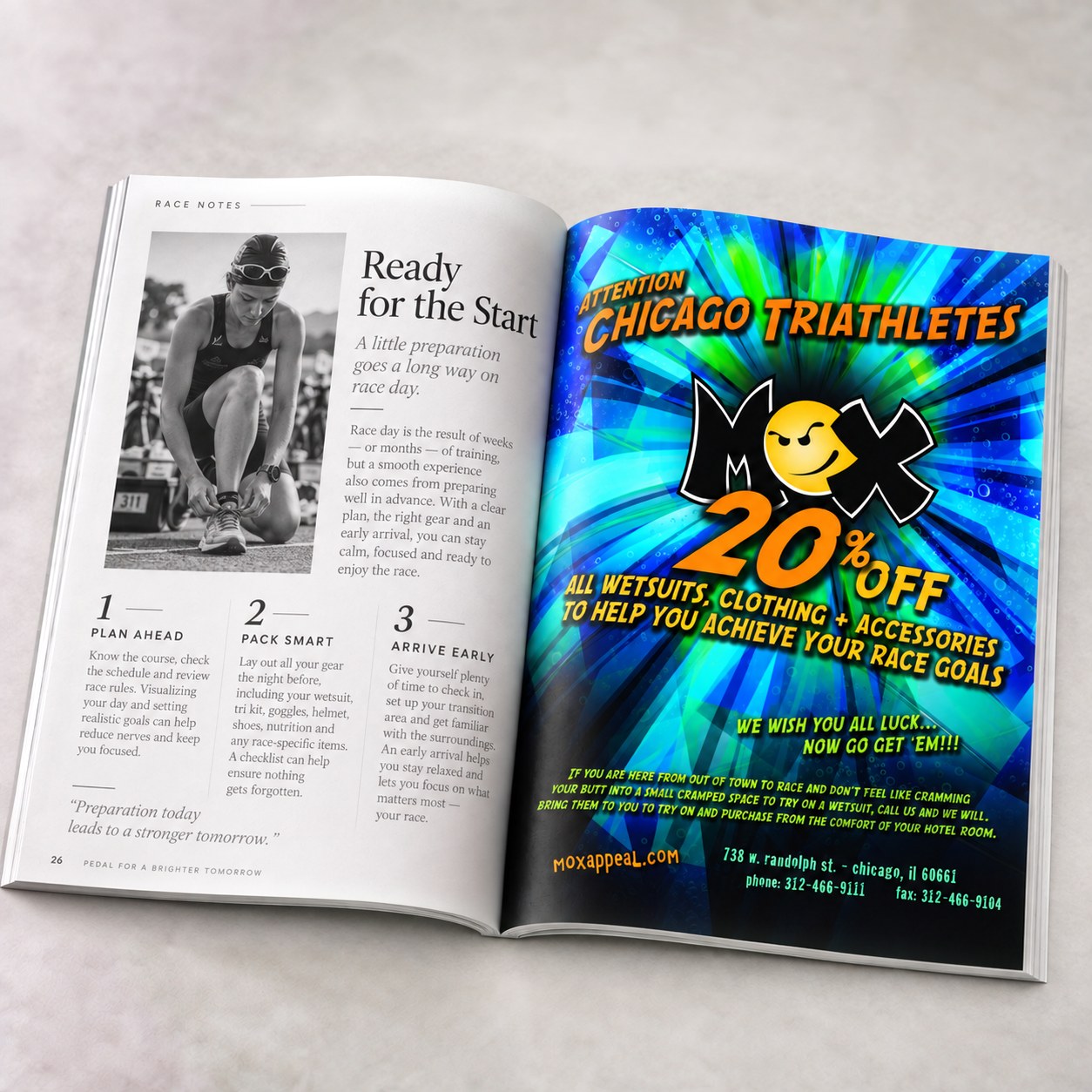
A series of magazine advertisements brought MOX Multisport’s playful identity to Chicago’s triathlon community. Bold color, energetic graphics, and the distinctive MOX mark connected brand recognition, race-day promotions, and a collaboration with Infinity Multisport.

Full-page layouts gave each message room to make an impact, while a vertical half-page placement carried the same personality into a narrower format. Across the series, the goal was consistent: catch the reader’s eye and make the offer easy to find.

Focus
Brand visibility & clear visual hierarchy
Deliverables
Full-page & vertical half-page advertisements
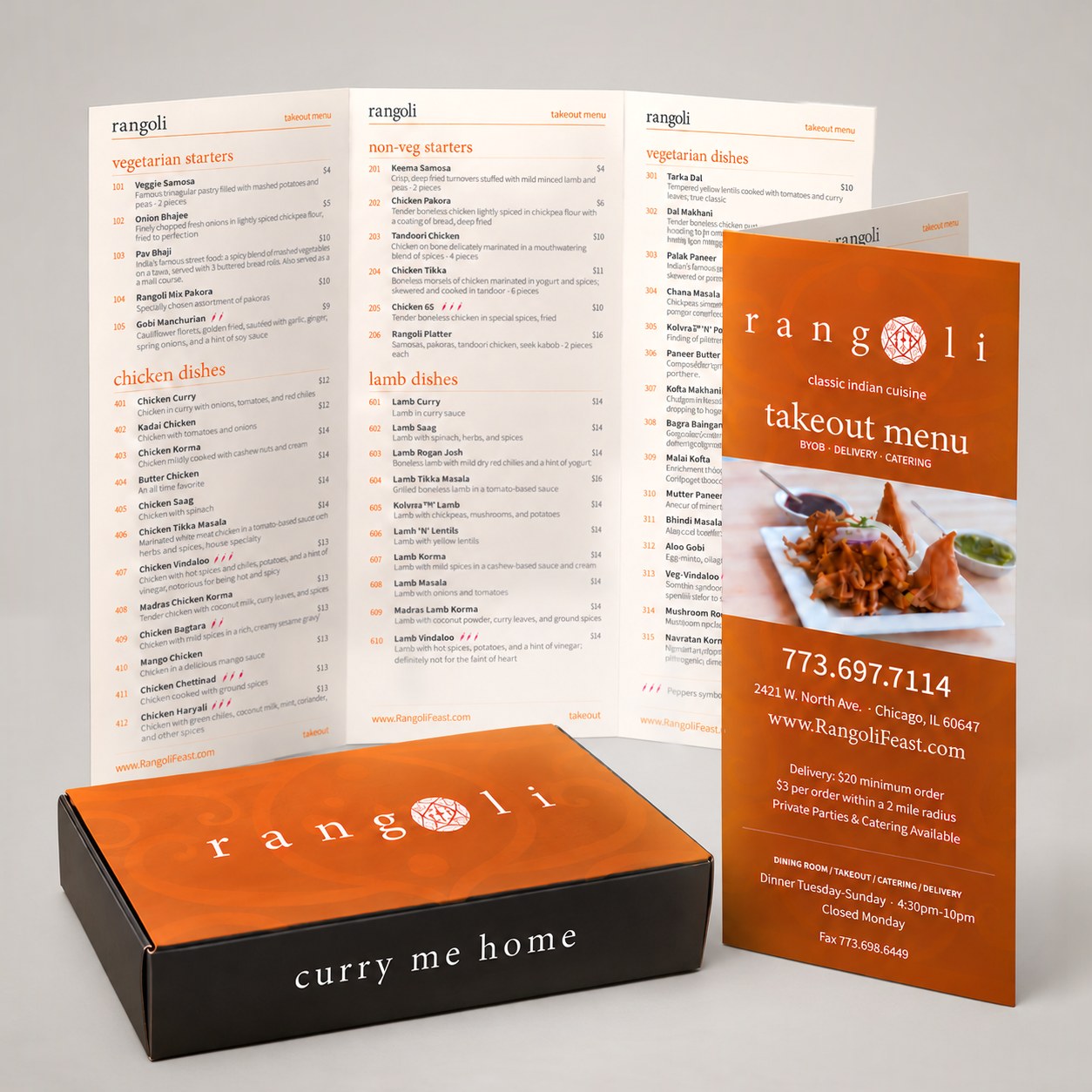
Rangoli takeout trifold menu, open and closed, beside a copper and black takeaway box reading curry me home
1 / 5
Print study / 04

a matter of taste

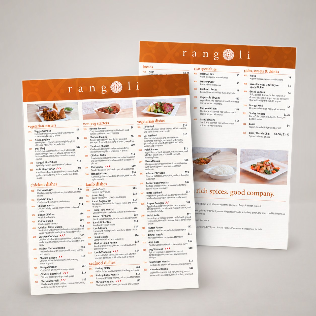
Rangoli / Menu Design

Rangoli began as a new Indian restaurant in Chicago. Working alongside Alan’s design studio, which was creating the restaurant’s interiors, we helped arrive at the name Rangoli, then designed the logo and carried it through exterior and interior signage, window decals, the website, and promotional materials.

The menu needed to feel like part of the room. Warm cream pages carry the content, while a coppery rust header, layered with a subtle tone-on-tone rangoli pattern, frames the white logo. Crisp black type keeps everything legible, and the same copper, cream, and black palette carries through the rest of the brand. With dozens of dishes to present, clear category headings, numbered items, short descriptions, and heat indicators help guests read, compare, and order with confidence.

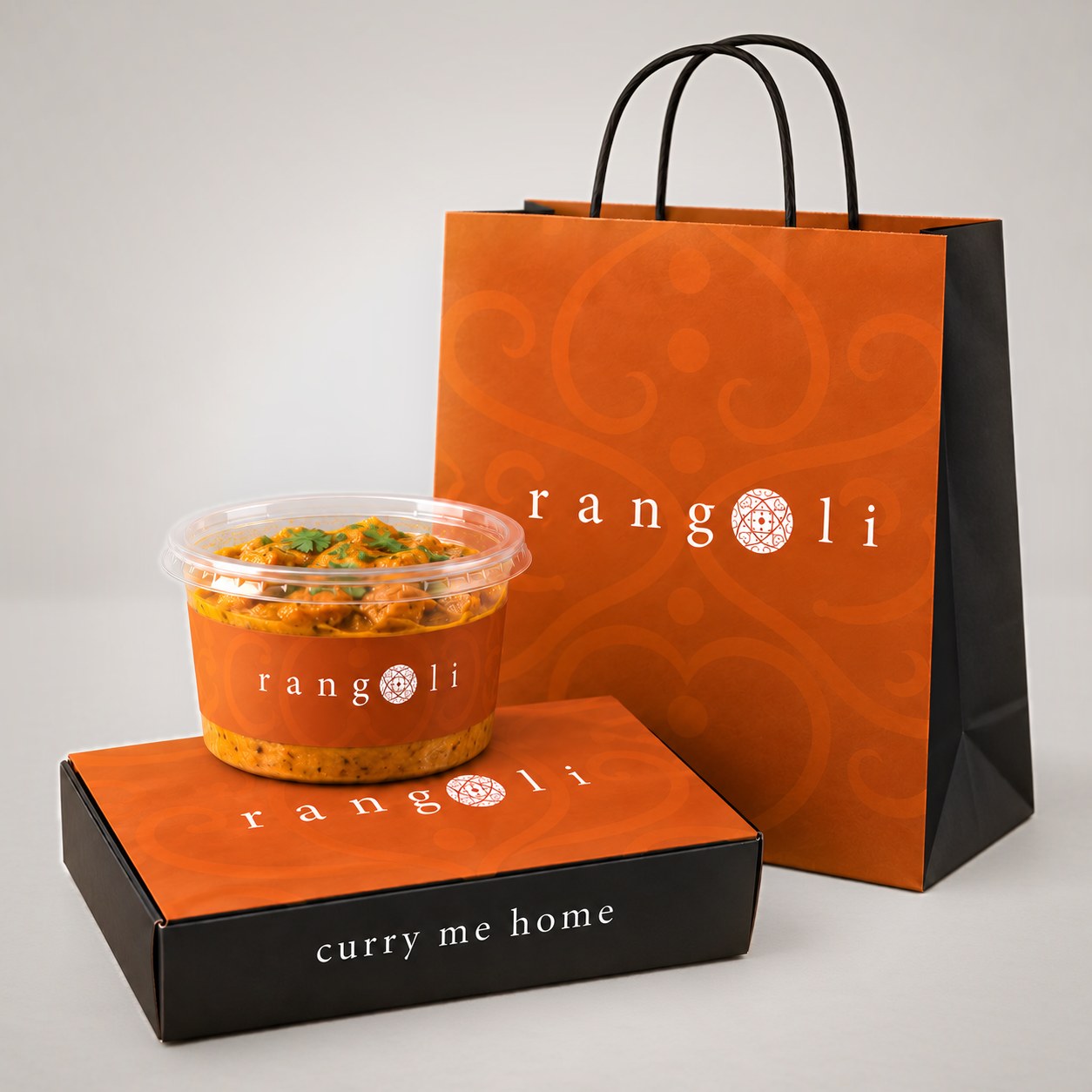
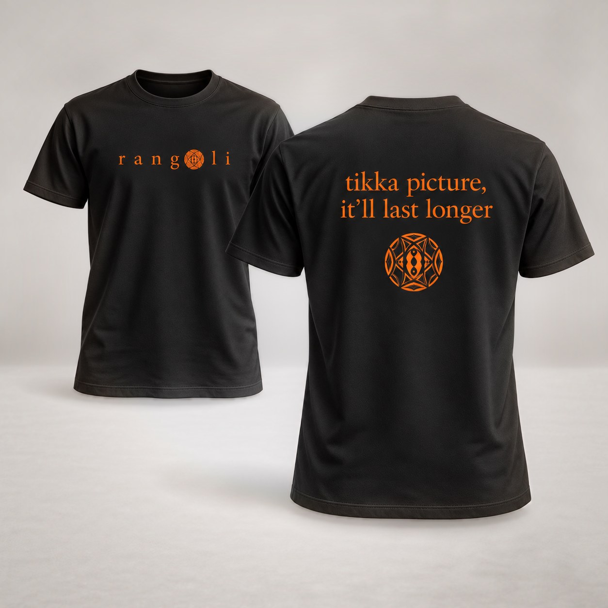
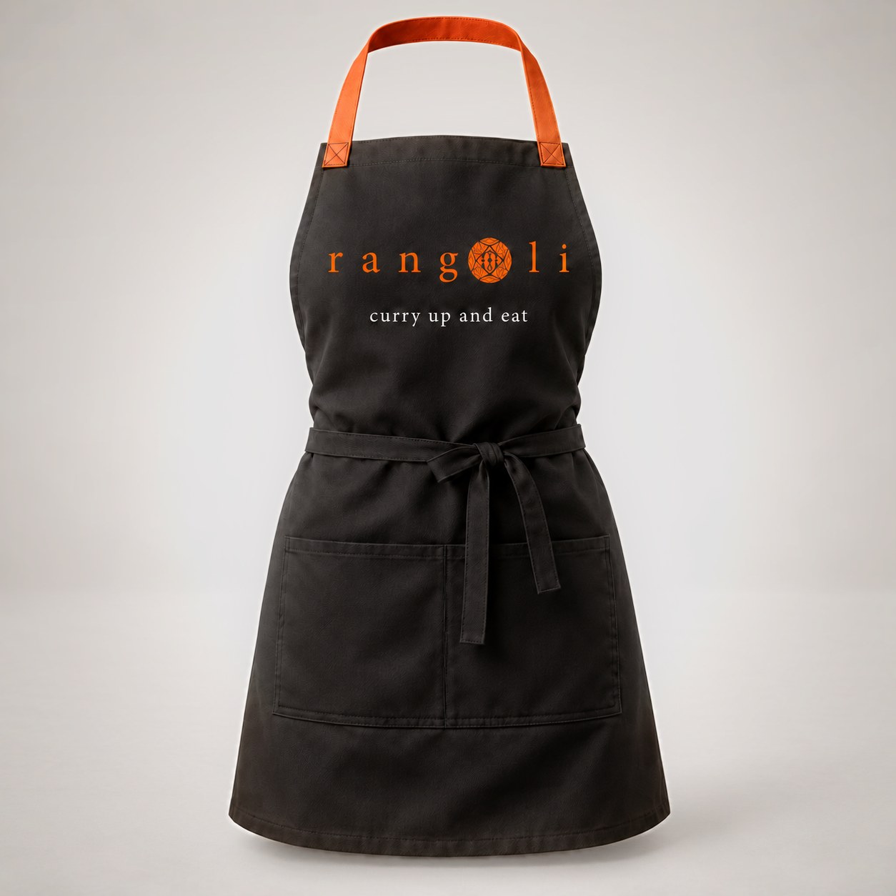
The same system carried into a trifold takeout menu, plus boxes, bags, and containers for to-go orders and leftovers, finished with a playful “curry me home.” Staff aprons and tees picked up the humor with lines like “curry up and eat” and “tikka picture, it’ll last longer,” so the experience continued well past the dining room.

The restaurant has since changed hands, and much of its look has changed over the years, but the logo we designed is still in use. The original system remains a favorite: a warm, cohesive expression of the brand that still stands the test of time.

Focus
Readability & brand continuity
Deliverables
Dine-in & takeout menus, takeout packaging & staff apparel
Boulevard Bash festival poster on a light plaster wall
1 / 3
Print study / 05

a neighborhood in full volume

St. Luke’s and Star Events / Poster Design

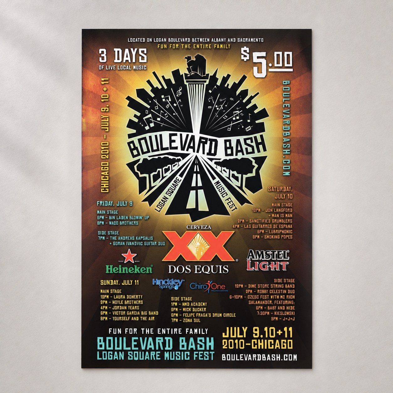
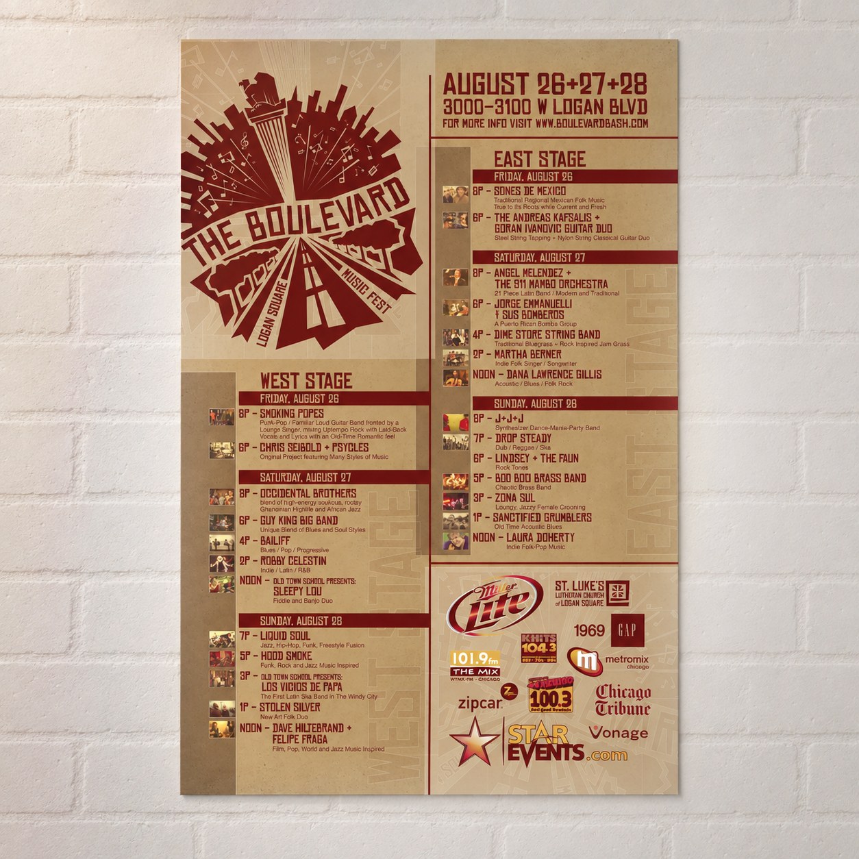
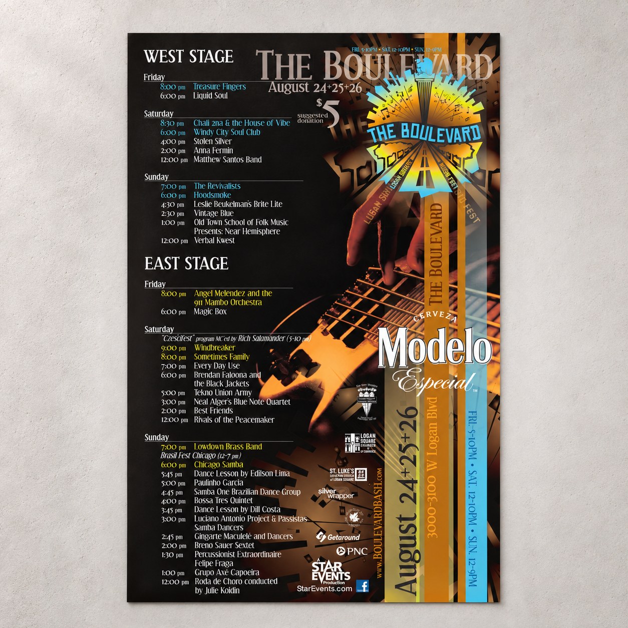
St. Luke’s wanted to bring its Logan Square neighbors together through a multi-stage music festival on Logan Boulevard. Launched as Boulevard Bash and later renamed The Boulevard by Star Events, the event needed an identity that felt rooted in the neighborhood and full of energy.

We carried the woodcut-inspired lettering of St. Luke’s brand into a distinct festival identity, combining the boulevard, tree-lined streets, and musical imagery. Each year received its own poster design, with the visual language extending to banners that connected stages, sponsors, and local food and drink vendors.

Across three seasons, the designs evolved with a growing festival and helped give it a recognizable presence in the community. Although funding and city politics kept a fourth year from moving forward, the series captures three years of neighborhood music, connection, and celebration.

Focus
Festival identity & community connection
Deliverables
Annual posters & coordinated event banners
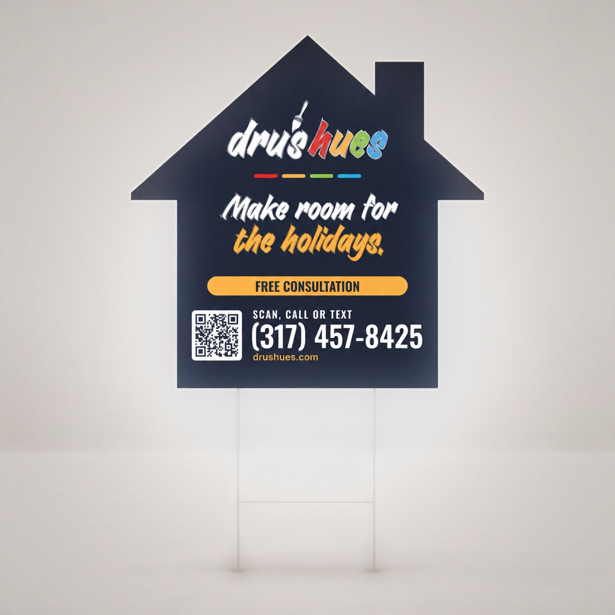
House-shaped DRUs Hues yard sign on a wire stake reading make room for the holidays, with a free consultation callout, phone number, and QR code
Print study / 06

a sign of the season

DRUs Hues / Yard Sign Design

With the holidays approaching, DRUs Hues wanted to reach Indianapolis homeowners getting ready to host family and friends. A yard sign put the message right where people live: make room for the holidays.

We cut the sign in the shape of a house, a simple nod to the work the crew does every day. The brush-script headline and the brand’s paint-stripe colors carry the DRUs Hues personality, while a bold free-consultation callout, a large phone number, and a QR code make it easy to act from the sidewalk or the street.

The sign is printed on both sides, with the chimney mirrored on the back so it reads as a house from either direction.

Focus
Seasonal visibility & an easy call to action
Deliverables
Double-sided, house-shaped yard sign

Every project starts with a clear idea.

explore all services